This article covers how we defined tokens at PayFit to create a flexible taxonomy for a small but powerful set of tokens. From primitives to semantics ones.
Design tokens are essential design decisions for creating a unified design language that bridges design and development. They are also crucial for helping both to understand and take correct design decisions. That’s why our tokens not only have to provide a scalable solution, these should also be understandable and relatable.
Token types
We classified our tokens into different types such as color, radius, space, and elevation. Over time, these categories will be expanded by adding new ones, such as typography or even ease tokens. In any case, these different types will be common to all token levels in our DS.
Token levels
Our tokens’ taxonomy builds on two different levels. We named primitives to the first level. If you're familiar with this topic, global or base are also common names for this level. And for the second level, we'll use semantics as a name.
Primitives
Primitive tokens help us understand different types, existing ranges, and values of our design system. They define the values in a system. For example, primitive color tokens would include every color used in your product. While primitive spacing tokens would include all the padding, margin, and gap values.
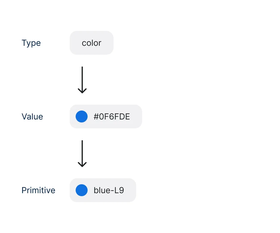
It’s vital to understand that our primitives tokens are the lowest level tokens and map directly to a raw value. Its name should be based directly on the values they represent, without implying any particular propose or context. For example, for primitives, we should use blue-L5 rather than a semantic name like primary.
The first version of our tokens are composed of the following types: color, radius, space, elevation. Each token name maps a value to a generic name and uses a consistent naming convention, such as type-name-value. (e.g., color-red-L9, radius-100).
Semantics
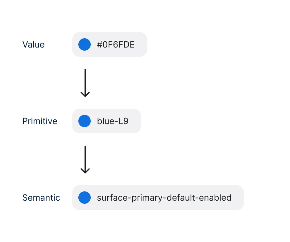
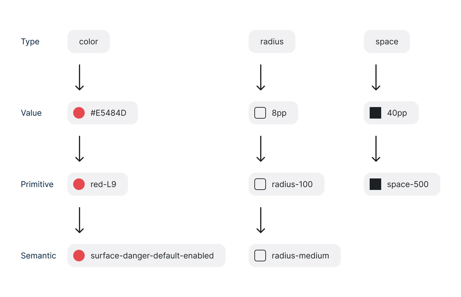
Our semantics tokens will refer directly to our primitives. This means that the value we'll use for a semantic token must always be a primitive token. Never a raw value. Following this approach, we'll be able to iterate our semantics values having to impact only our primitives.
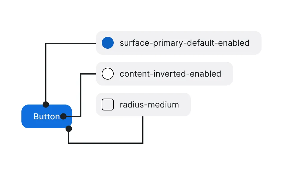
The semantics taxonomy is made up of five different dimensions that match visual representation needs, brand, and interaction states:
- Type: the type of token. (color, radius, space, elevation).
- UI Element: where the token will be applied. (canvas, surface, content, border, form, surface-inverted or content-inverted).
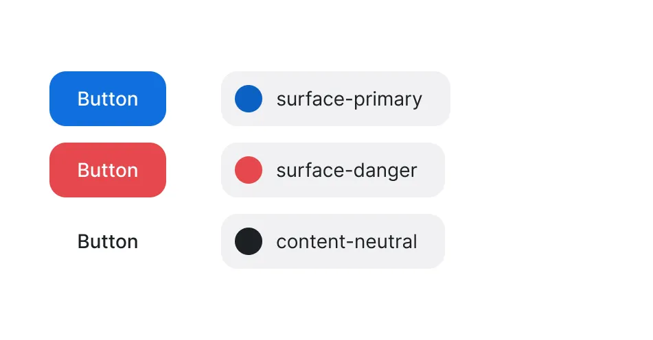
- Role: It defines the purpose or function of a UI element. (primary, neutral, warning, success, danger, promo)
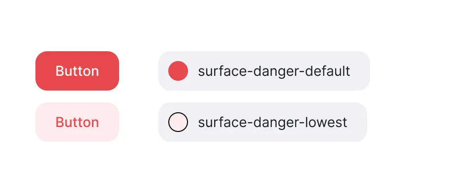
- Emphasis: Refers to the hierarchy relative to the role. (lowest, low, default, high, highest).
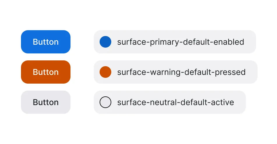
- State: Defines the interactive condition of an element (enabled, hover, pressed, focus, active, disabled, read-only).
Type
Refers to the type of token, such as color, radius, space, or elevation, specifying the token's functional category and ensuring consistency in style application across the system.
- Color: Defines all the different colors we’ll be able to use, including specific tokens for interactive states like hover, disabled, and pressed.
- Radius: Sets the border-radius of elements. From sharp to rounded corners, radius tokens contribute to a consistent convention, allowing uniform styling across buttons, cards, forms, or dialogs.
- Space: Our spacing system uses a modular 8pp unit scale for padding, margins, and gaps. It ensures consistent alignment and supports responsive design. Although we have plans to include spacing tokens within the semantic level, for the moment we decided to only implement spacing tokens as primitives.
- Elevation: Defines shadow or to establish depth. This allows components to appear more prominently, enhancing visual hierarchy and user focus. We decided to name this category Elevation to not compromise the tokens’ scalability. For example, for a light theme, we may use different shadow values to establish depth, but for a dark theme, a different solution may be better, such as blur effects.
UI Element
UI Element dimension apply conventions to specific UI elements, creating consistency between the different elements.
- Canvas: Represents the primary page background. Like a real canvas, it's the place where we'll put everything.
- Surface: The different surfaces we will be able to add on top of the canvas.
- Content: Encompasses text elements and icons.
- Border: Used for elements outlines, or dividers.
- Surface-inverted and Content-inverted: These inverted tokens support high contrast needs. For example, elements placed on top of dark surfaces. It should not be understood as a resource to support the dark and light themes.
Role
The Role dimension defines the purpose, hierarchy, and importance of each element.
- Primary: Represents the brand color and the main actions, drawing user attention and indicating key actions in the user experiences.
- Neutral: The most common usage. For interactive, non-interactive, or supporting elements, ensure a balanced and unobtrusive look.
- Warning, Success, and Danger: Define a functional system for user feedback and alerts. Warning draws attention to important notices; success indicates completion or validation; danger indicates errors or destructive actions.
- Promo: Emphasizes promotional content, such as promotions or new features, drawing attention with specific styling.
- Form: Dedicated for form elements, like Text field, Select, or Checkboxes, ensuring their identifiable and correct use across contexts.
Emphasis
Emphasis dimension establishes a hierarchy relative to the role. It ensures that each component is styled according to its level of importance.
- Lowest and Low: Suitable for subtle elements or elements that are meant to remain with a low emphasis level.
- Default: The emphasis level by default. The emphasis level will relative to the element's role.
- High and Highest: For use cases where we’ll require to highlight elements such as texts, doodles, or backgrounds.
State
State is the last and only required for interactive elements dimension.
- Enabled: The default state, defining the appearance of interactive elements.
- Hover and Pressed: Define the styling when a user interacts with components, offering visual feedback that enhances usability.
- Focus: Used for keyboard and accessibility focus rings, ensuring visually prominent styling to guide users, especially those with visual impairments.
- Active: Indicates the current or selected state, commonly applied to navigation or toggle components.
- Disabled and Read-only: Visual styles for non-interactive elements that indicate when an element is unavailable or static.
Implementation Strategy
- Establish a cross-functional team to collaborate with designers, content designers, and developers to ensure each token category is meaningful and versatile across teams environments. Continuous feedback and iteration will ensure tokens meet both user and brand needs.
- Use clear naming conventions such as
{type}-{ui-element}-{role}-{emphasis}-{state}to create predictable, reusable tokens that are easy to apply and adapt across different components. - Comprehensive documentation is crucial for adoption. Provide visual examples and usage guidelines for each token category. Training sessions can be used to familiarize teams with the tokens’ taxonomy, ensuring consistent application.
- Implement versioning practices to track changes in the design system, ensuring version control compatibility while accommodating iterative improvements. Regular audits of tokens for redundancy or lack of use will also help maintain a streamlined library.
- Required efforts should be considered to implement automatized cross-platform processes. As a recommendation for Figma users, I’d suggest getting the most of the Code syntax feature and considering the idea of adopting tools such as Tokens studio to sync your design tokens with code.
Conclusion
Defining and implementing a flexible design token taxonomy is not easy. The design system will gain flexibility, consistency, and scalability. Furthermore, a structured approach will promote a clear hierarchy, defined roles, and greater adaptability, making it easier to extend, maintain, and unify the brand experience across all digital platforms. However, it will require time and commitment to logic, naming conventions, and defined taxonomy. Your company design culture must be prepared for this. If not, it's probably better to adopt a components library like Shadcn, Radix, React Aria or similar. After all, we have to learn to choose our battles.